
Doctowell – a Better Way to Find Your Doctor
Set out to be a one-stop e-medicine platform for the Baltics - find the right specialist and book a virtual or in-person visit without leaving home. I joined as the solo product designer for a 3-month sprint, taking it from research through a full end-to-end flow and a working UI covering search, booking, patient records and telemedicine.
Role
Product Designer
Timeframe
2021 (3 months)
Contribution
Product research, User experience, UI design, Design system
Background
Doctowell wanted to be a one-stop e-medicine service for the Baltics — find the right specialist and book a virtual or in-person appointment without leaving home. Latvia has good doctors, but no centralized way to find them: patients were stuck in long queues or piecing together outdated directories just to get treatment.
A quick disclaimer: the project stalled when the client ran into funding issues and it never reached production. I'm including it here anyway — it's one of the more complete end-to-end flows I've designed, and it shows how I approach a 0-to-1 problem.
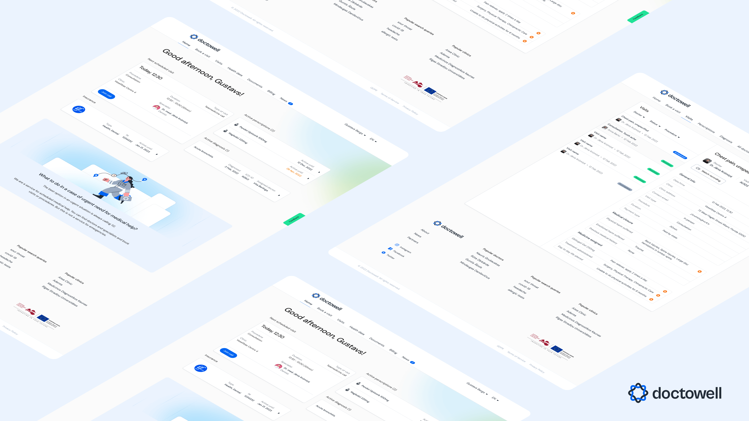
Solution & Goals
The solution: a fast, easy way to find the right doctor based on your needs, with your data and appointment history centralized in one account — search by location, treatment type, availability or reviews, and book in a few steps instead of a phone queue.
User goals: find the right doctor faster, cut the wait, see real availability before committing to a booking. Business goals: keep doctor calendars full, and become the leading e-medicine platform in the Baltic states.
Research & Market
I ran a survey with 50 respondents to understand why e-medicine hadn't caught on locally. Three barriers came up again and again: poor user experience, long wait times, and low trust in the services available. 63% of respondents hadn't used e-medicine at all, mostly from a lack of information or plain distrust — and people said they'd switch providers for a shorter wait, if data security was handled well.
I also mapped the two local competitors. E-Veselība is the government's platform — deep integration with e-recipes and sick leave, but an expensive rollout with poor UX and frequent outages. Piearsta.lv has the largest local user base and decent usability, but it's Latvian-only, its infrastructure is confusing, and development has stagnated. Both left an opening for something built around trust and a genuinely easy booking experience.
The constraints were real — the market starts out limited to Latvia, the feature scope is massive for a small team, and centralizing health data across clinics is a hard problem on its own. But there were real possibilities too: the founding team included physicians and medical innovators with 10+ years of experience, there was a case for medical tourism (patients from Germany looking for affordable Baltic care), and — if the experience actually held up — room to expand into a clinic management product for the same customer base.
Brand
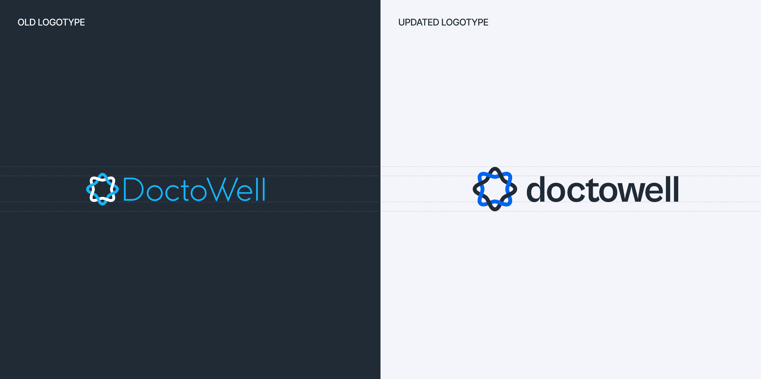
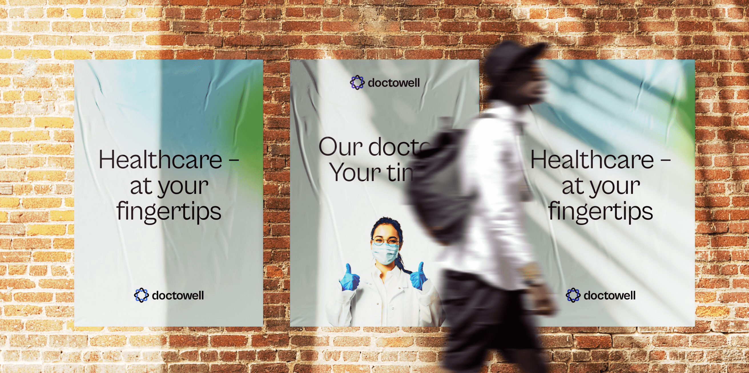
The existing identity felt dated for a service trying to earn trust from scratch. I refreshed it with a bolder color palette and a simplified typeface — something that reads as contemporary and forward-thinking rather than clinical.
User Flow & Product Discovery
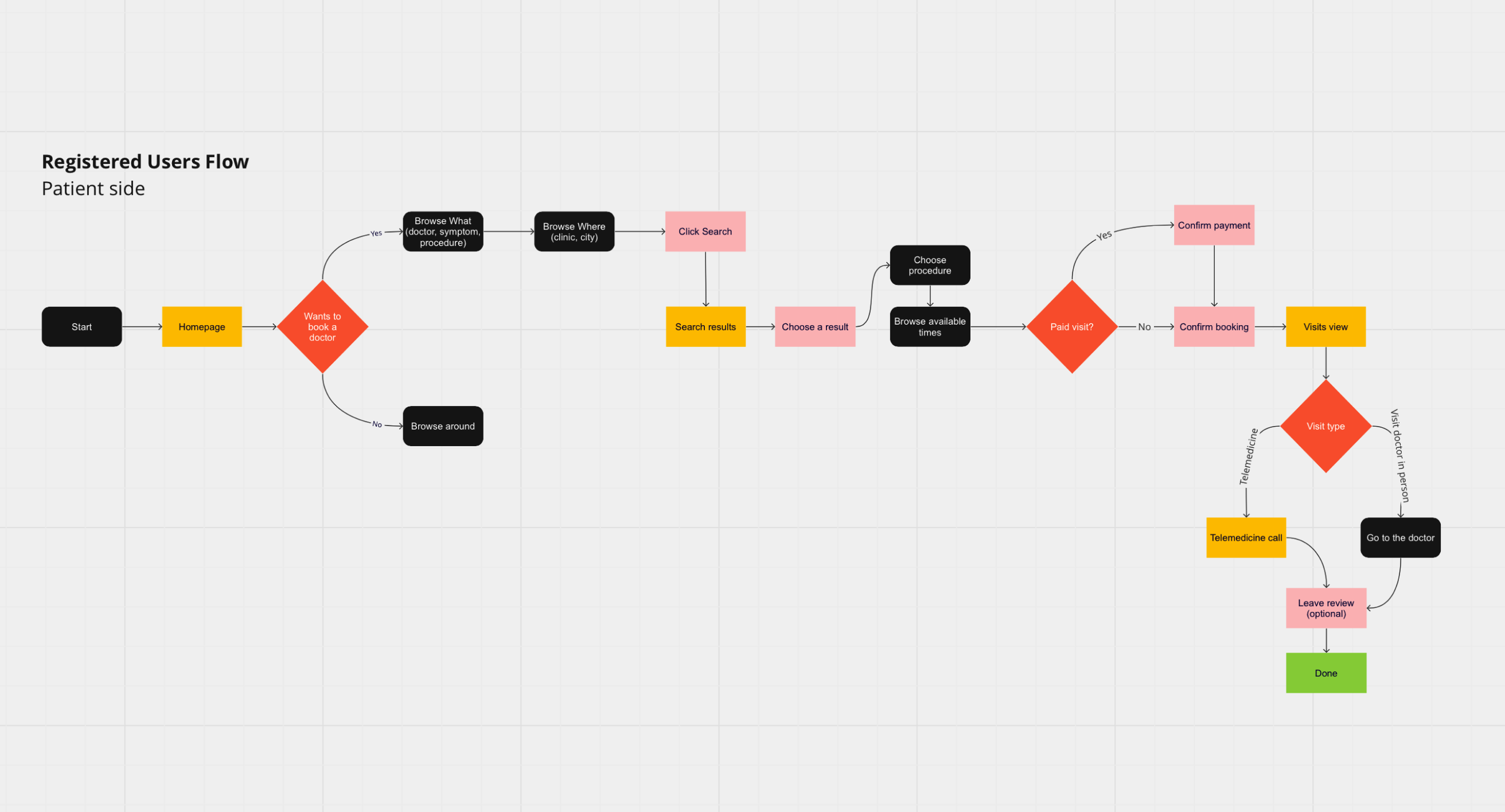
Before touching any screens, I mapped the registered-user flow end to end — from landing on the homepage through searching, picking a result, choosing a time, confirming payment, and the two branches at the end: a telemedicine call or an in-person visit. Laying it out this way surfaced gaps early and kept the whole team aligned on how the system actually worked.
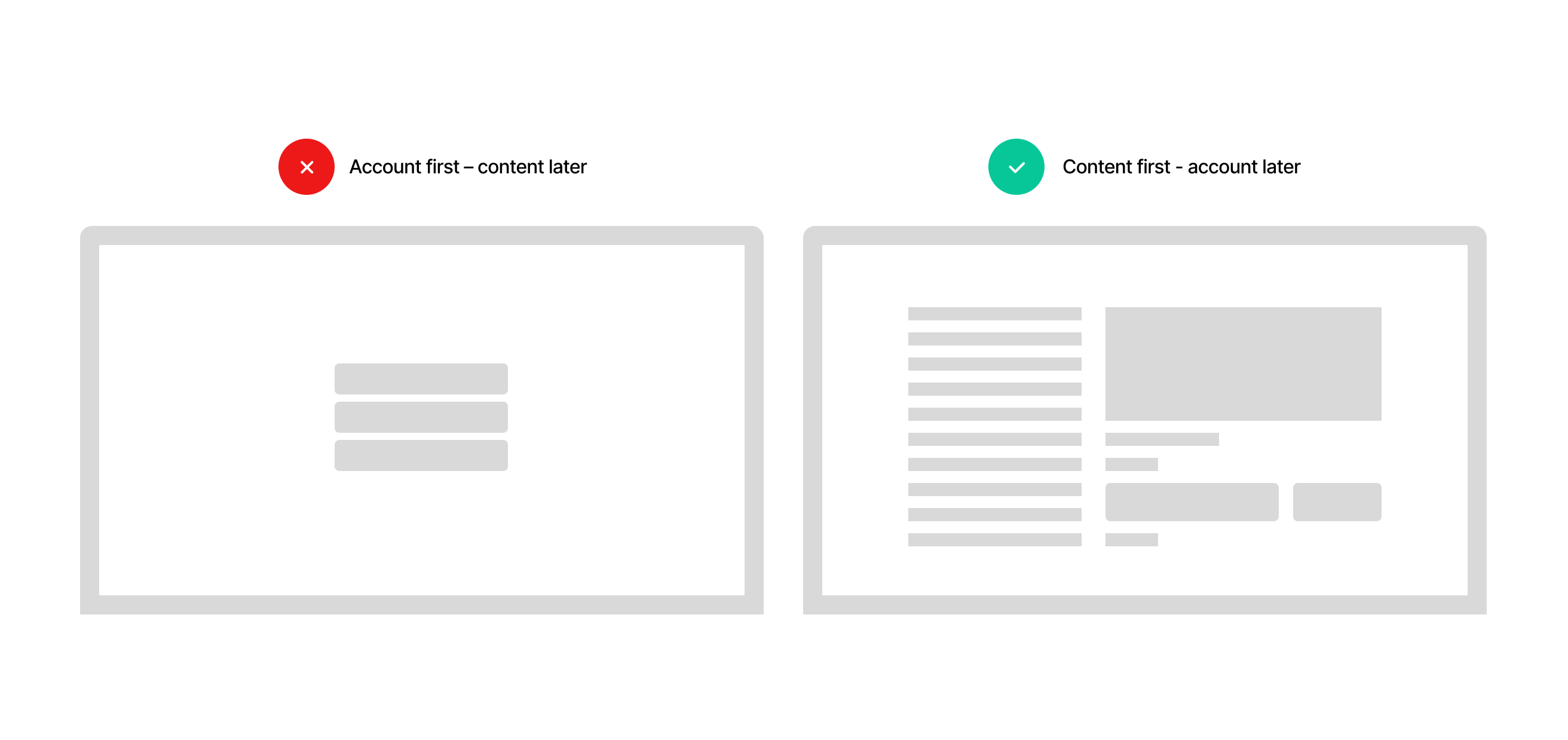
One deliberate call: let people search, browse doctors and explore booking calendars before asking them to create an account. Making people commit to an account before they've seen any value is a fast way to lose them — a few minutes of browsing first makes finishing the sign-up feel worth it.
Product Design
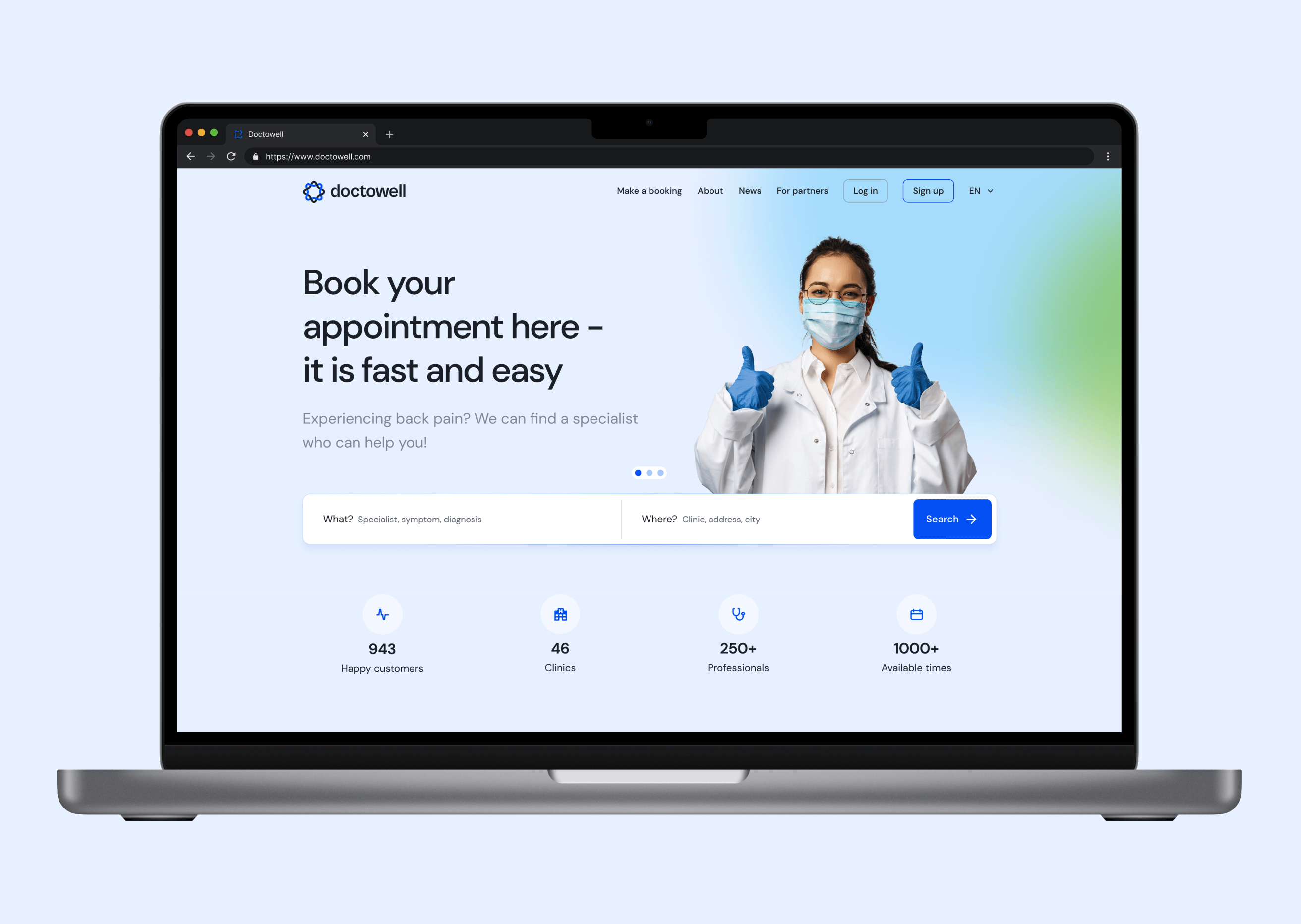
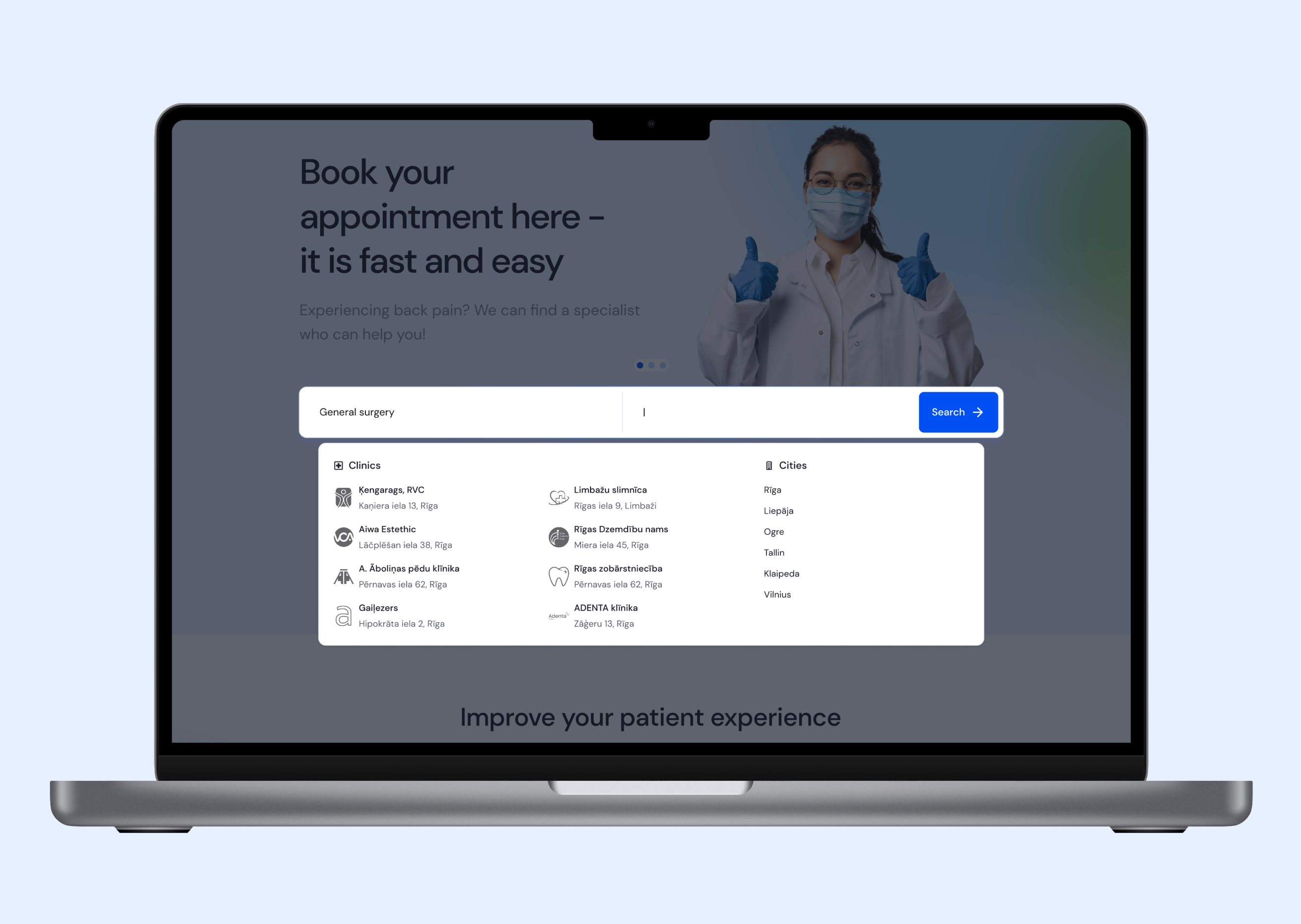
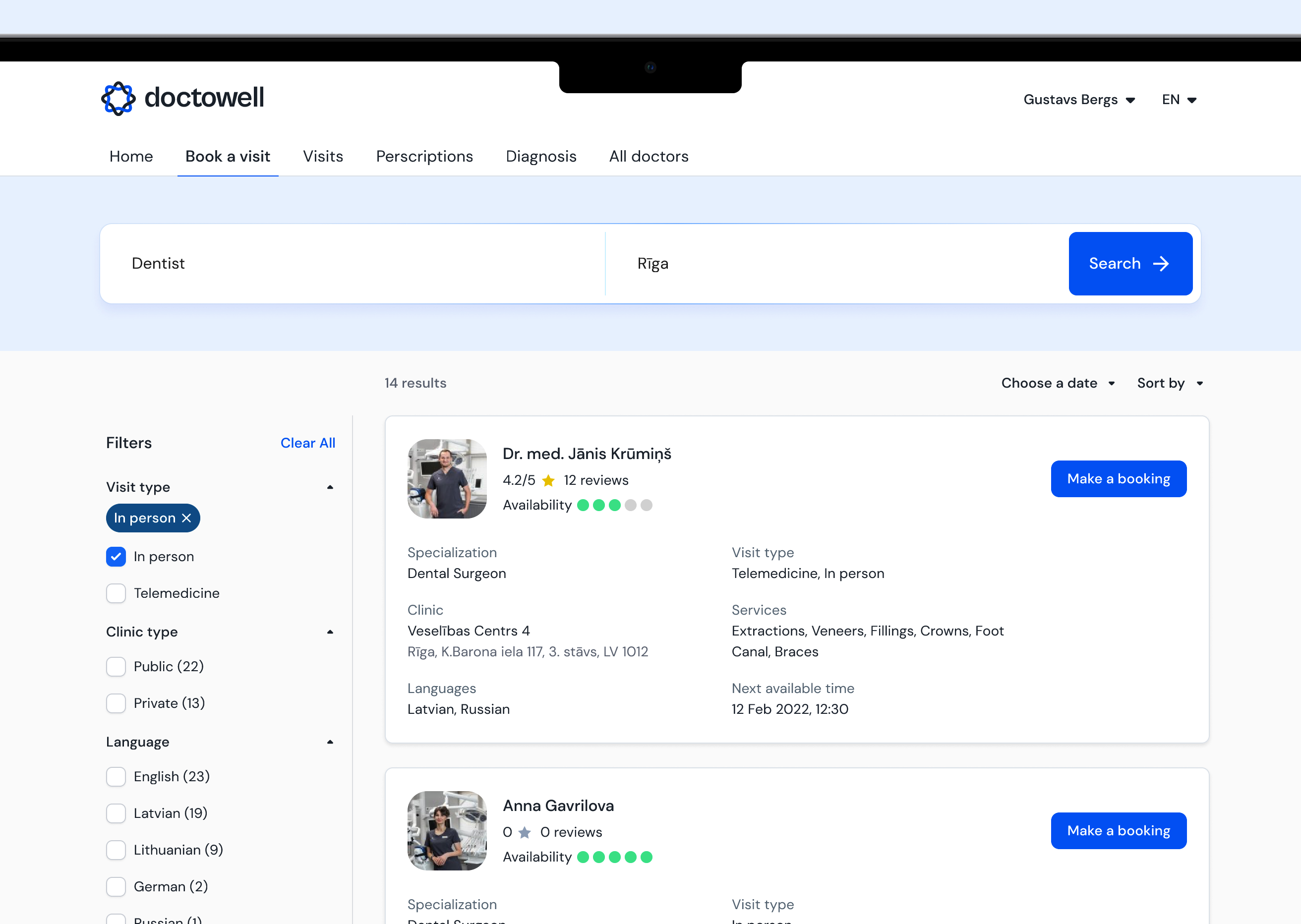
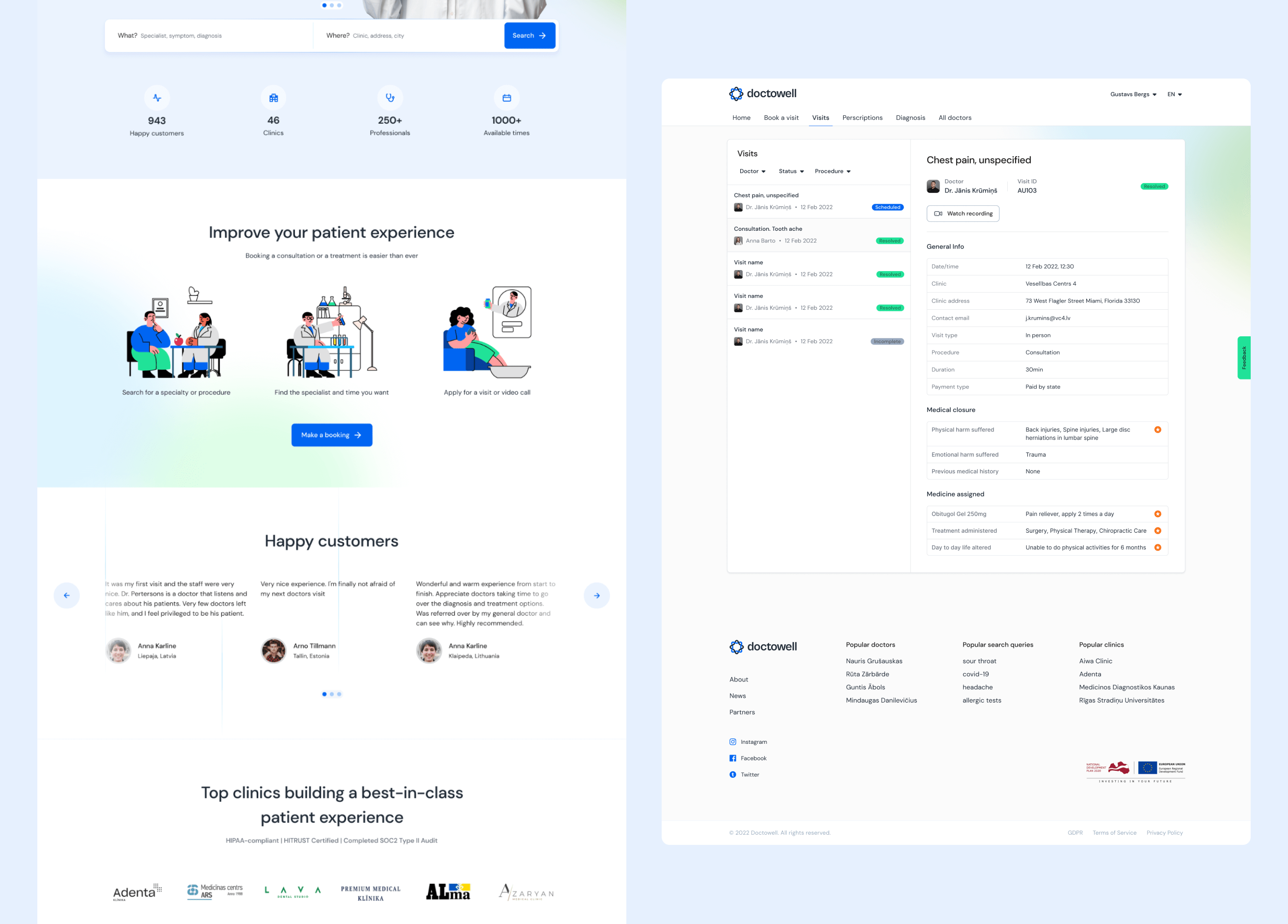
With the flow settled, I moved into layouts covering the core functionality: the marketing homepage, the What/Where search with clinic and city autocomplete, and the results list with filters for visit type, clinic type and language — everything needed to go from "I have back pain" to a confirmed appointment in a few steps.
Patient Portal
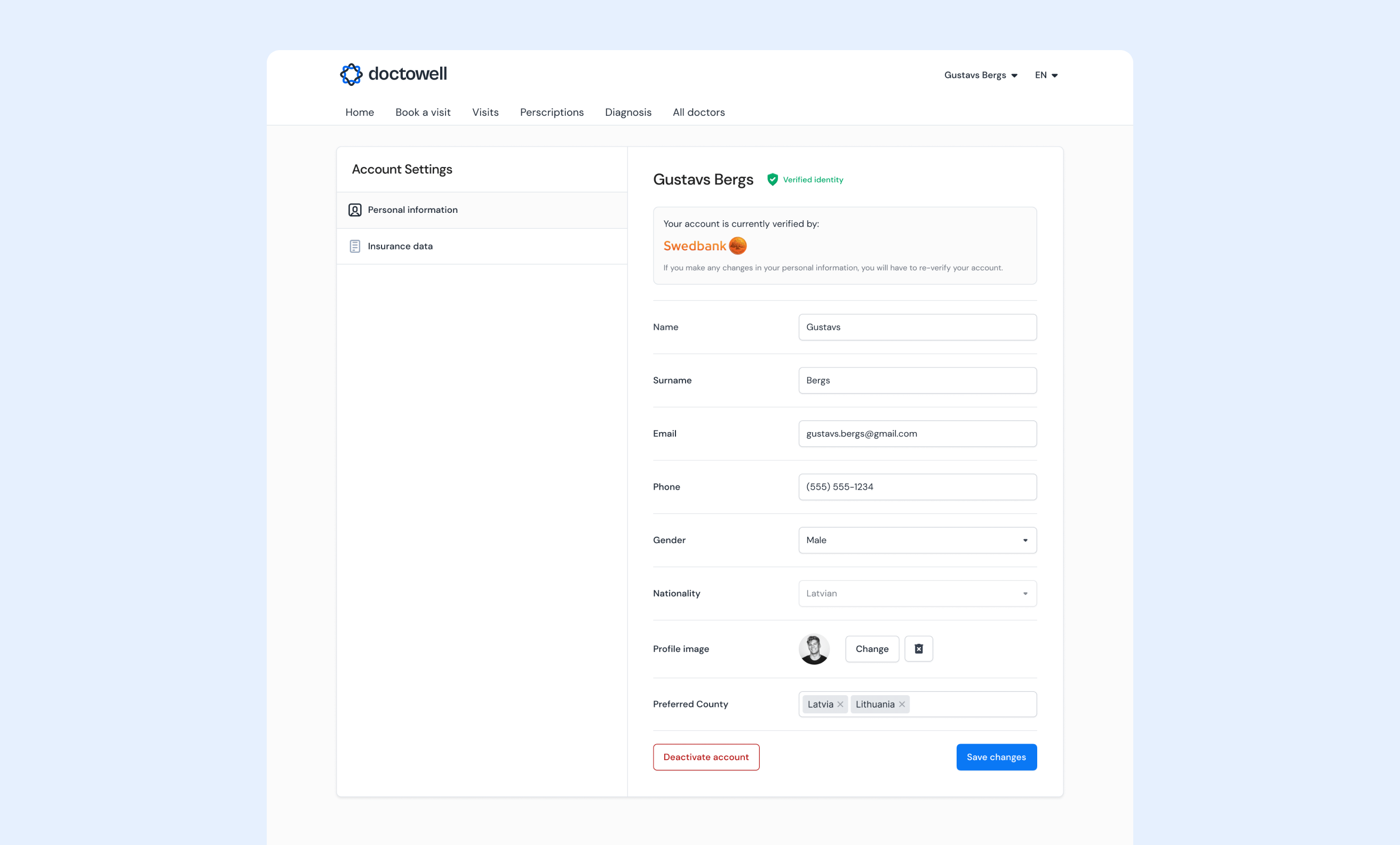
The logged-in account handled everything past the point of booking — active visits with full medical closure notes, prescriptions and diagnosis history, plus account settings with identity verification through a bank login, a common pattern for e-services in the Baltics.
Telemedicine
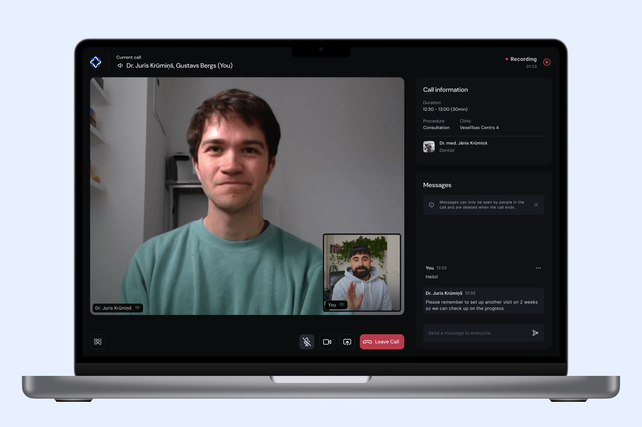
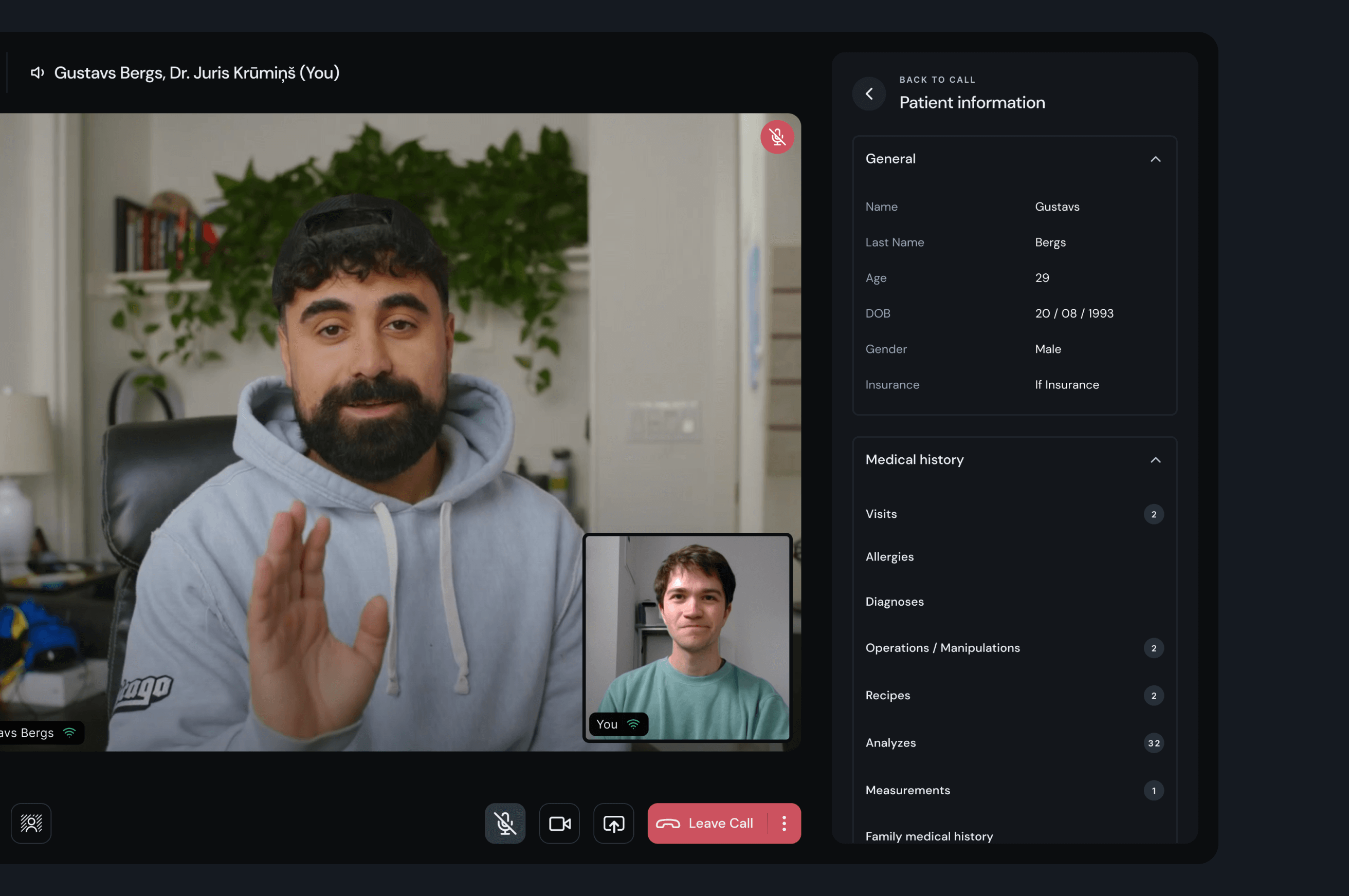
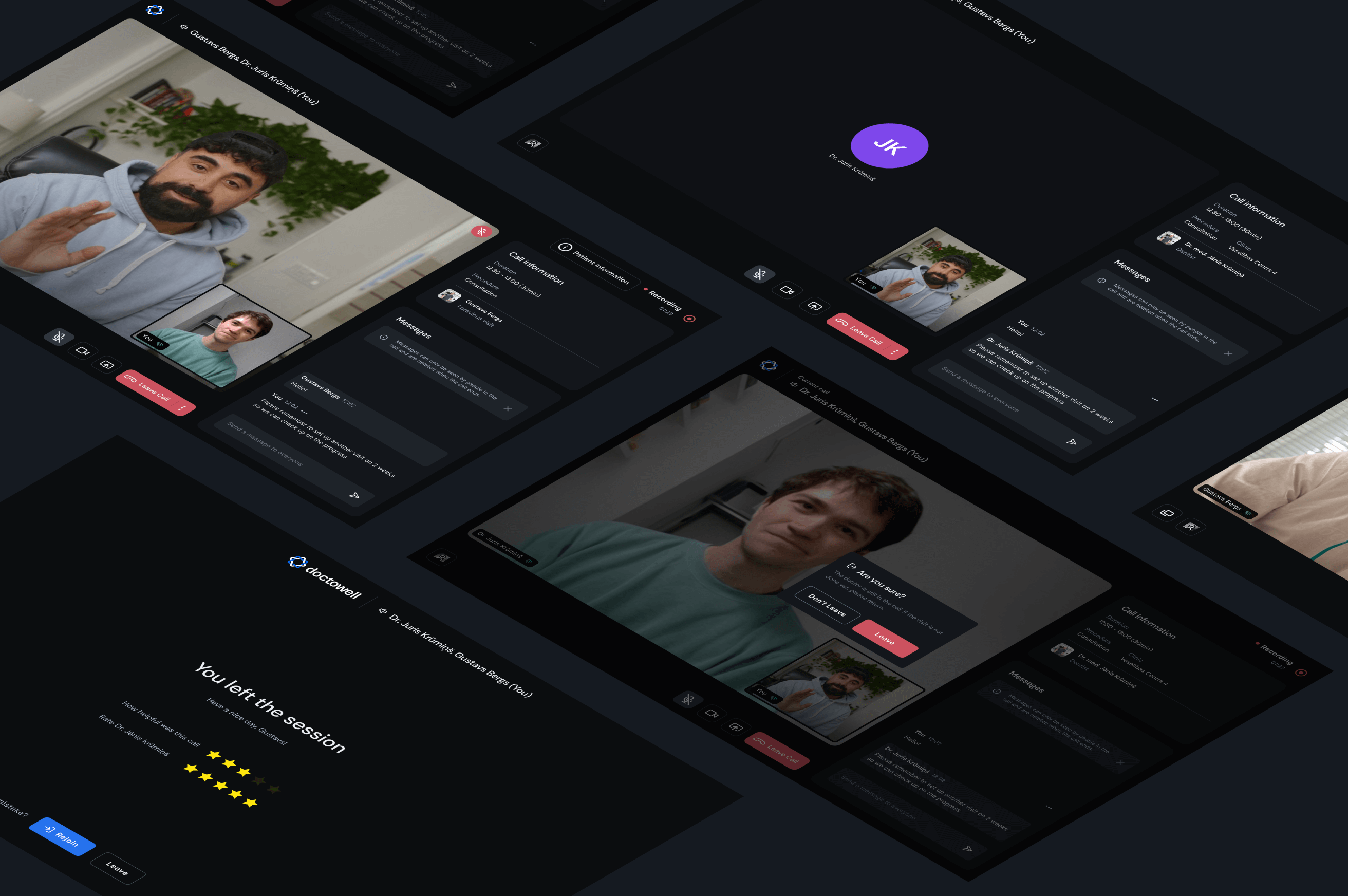
Telemedicine was the core of the product. The video interface needed to stay out of the way during a consultation while still giving the doctor everything they needed — patient info, medical history and messaging — without breaking the call. I designed both sides: the patient's simple, focused call screen, and the doctor's version with a full patient-information panel to reference mid-session. I also worked through the smaller moments — leaving a call, the confirmation prompt if the visit isn't marked done yet, and rating the consultation afterward.
Component Library
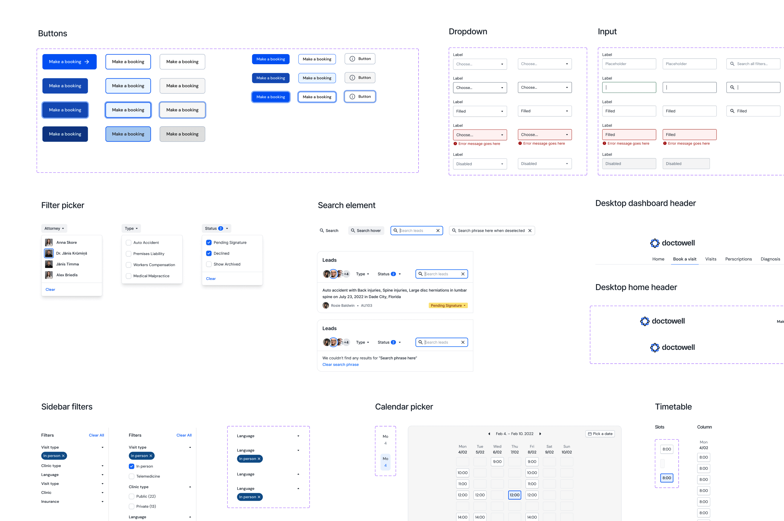
I built a small foundational design system alongside the screens — buttons, inputs, dropdowns, filters, calendar and timetable pickers. Nothing exhaustive, but enough to keep the product consistent and make future screens faster to design.
Conclusion
The project never shipped, but it's one of the more complete systems I've designed from scratch — research, flow, UI and a starter design system in three months. The main challenge was managing an ambitious feature list against a tight timeline; the fix was breaking the work into tiers, each with a defined set of features to complete before starting the next. I finished tier one before the project was shelved. Even unfinished, it was a good lesson in scoping a big idea down into something buildable.